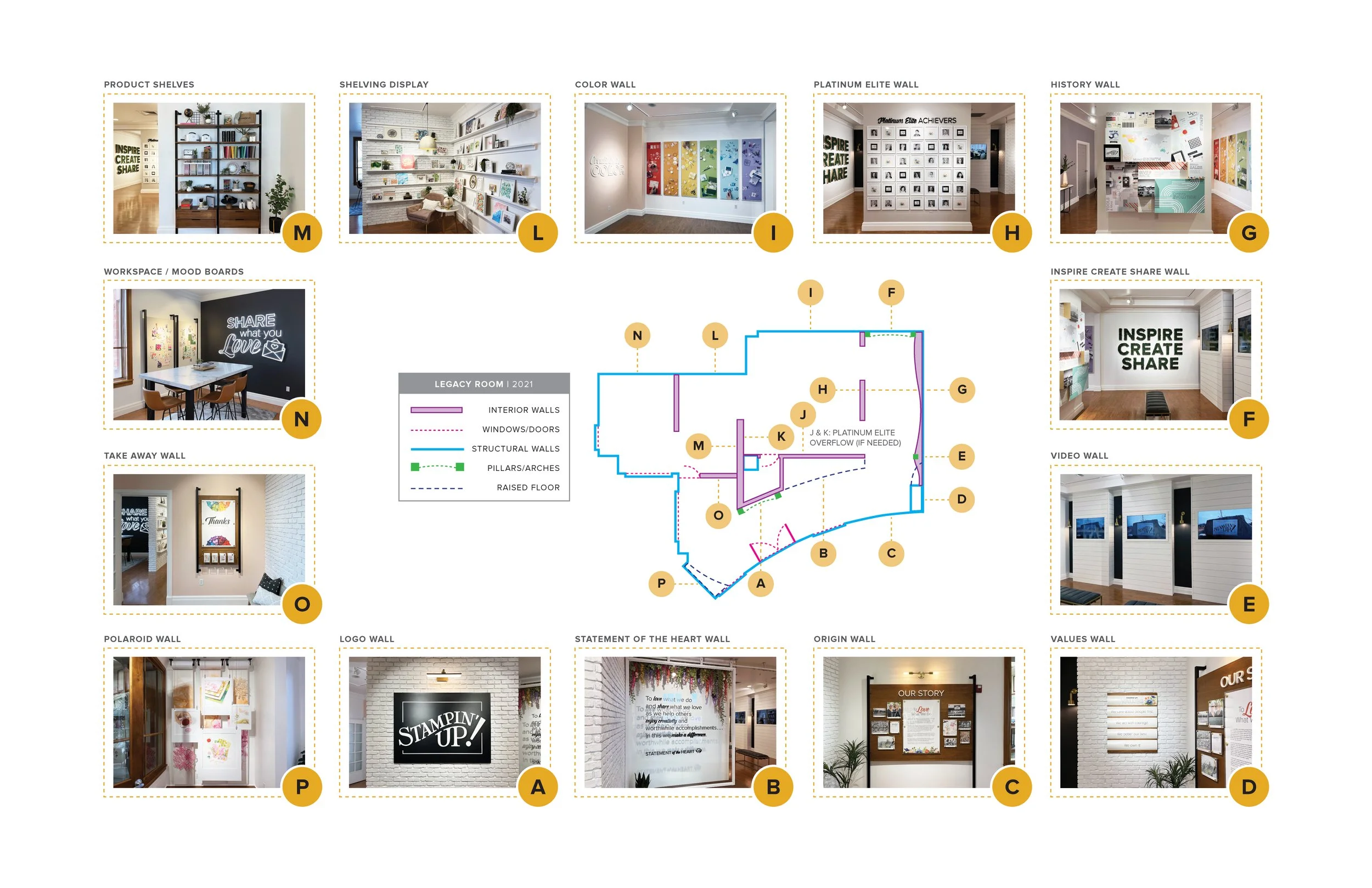
ENVIRONMENTAL DESIGN
STAMPIN’ UP! LEGACY ROOM
One of my favorite projects while working at Stampin’ Up! was collaborating on revamping the Legacy Room.
This is a space where visitors to the brand’s home office can learn about the history and vision of the company, view and experience products, watch video footage of the different facilities and processes, and get a feel for the company as a whole. It was a privilege to be selected to work on this impactful project. During this project, I researched company history, designed and prepared mockups of the space for review and approval from the creative director and CEO, designed, curated, and art directed the photography, worked with an external vendor to produce all installation pieces, and prepared documentation for ongoing maintenance of the space.
With the vendor, I explored and approved materials, provided feedback and oversaw all physical installation and production of the final space. Due to time constraints and the vast scope of the project, another designer was pulled in to finish the final design applications of Areas O and P after I had generated the initial concepts. She also gathered interior design options for furniture, wallpaper, and props for the space. All other design unless otherwise noted—from physical installations to graphic applications are my own.

Put a logo on it.
When visitors come through the double door, they are greeted by an oversized steel logo that sets the tone for the space.

Make a difference.
Photos really can’t do this justice. The company’s mission statement is made out of acrylic letters and mounted on a glass frame that runs along an overhead track. This allows handmade artwork behind the glass to be changed out periodically. The paper flowers shown here were made by in-house concept artists and add color, dimension and vibrancy to the entry.

Tell the brand’s story.
One of very few requests from the CEO and Co-Founder when we began this project was to tell the company’s story. The brand is deeply rooted in its family business start and this wood and metal mounted panel showcases glass-layered plaques that can be updated as the company continues to grow. For this space and many others, a priority was finding design solutions that could evolve with the company over time.

Share the values.
Inspired by some innovative restaurant menu displays where paper could slide in and out of grooves to create a rounded, three-dimensional appearance, this simple application gives an elevated presence to the company’s four values: We care about people first. We act with courage. We better our best. We own it.

See the brand in action.
Three columns were constructed to hide video screens and the technology to power them. These run separately and usually showcase tours of the company’s two Utah facilities in Riverton and Kanab, along with a behind-the-scenes look at how the company’s stamps are made.

Inspire others.
This was one of the few existing ideas that was somewhat solidified when I came on to the project. The external vendor and creative director had had visions of a “living wall” with greenery and the company’s tagline. My job was to refine the typography, figure out width and depth of the wooden letters and see it through to completion.

Honor the history.
One of the most complex and time-consuming elements of this project was depicting the company’s 35+ year history. There were so many milestones worth depicting but the traditional timeline would be quickly outdated. One day I happened upon a photo of all different sizes and shapes of cardboard boxes stacked up. I knew the depth and dimension of this inspiration would be visually impactful and allow me to give different weight to various categories of milestones.

Recognize people.
In the earlier installation of the brand’s recognition wall, there were some difficult constraints. One was the photos were self-submitted, creating huge variation in color and lighting. There were others who didn’t want their photo posted. And the number of achievers was constantly changing. This is the one wall that requires constant maintenance. The resulting design incorporates B&W photos to create more cohesion, standardized floral corporate fillers and logos to fill “empty” space while maintaining the 7x6 grid.

Lean into strengths.
One of the brand’s differentiators in the crafting space is color. Stampin’ Up! takes great care in ensuring their dozens of brand specific colors are a perfect match across paper, inks, embellishments and other products. This was also the perfect place to showcase the brand’s beautiful photography. Myself, one other designer and two photographers created every piece of this ode to color that was photographed and printed on oversized panels inset into floating frames.

Tribute to the artists.
The company boasts a huge number of creatives. Central to the extensive product world are illustrators, designers and concept artists that create all the company’s original products and then showcase a library of inspiration for each product to show customers how they can be used. This space includes original artwork for products sold and post-production examples of cardmaking using the various products, tools and techniques.

Display the goods.
The creative space wouldn’t be complete without showcasing Stampin’ Up! products. These mounted bookshelves were designed from my inspiration by our external vendor to match the other installations in the space and provide a physical display of products, packaging, tools, swag and merch that represents the brand’s extensive crafting offering.

Take time to craft.
Adjacent to the product display is a creative workspace that is used for filming, special events and other small company activities. Complete with a custom LED sign and oversized fabric-covered moodboards that showcase current coordinating products, this space is the perfect homey crafting environment.

Take it with you.
Dubbed the “takeaway wall”, this mounted display features modular clear acrylic boxes of different sizes that can be swapped out to hold printed materials including catalogs, postcards, and other event specific materials.

Show off.
The final farewell to the space, visible as visitors enter and exit through the wall of glass windows is rolls of “paper” hanging from the ceiling and layered with framed images from the brand’s product line, giving homage to the brand’s focus on stamps, ink and paper.